Anderson Brothers


- UX
- Art Direction
- Design
- Development
- Prismic
- Motion
Overview
Anderson Brothers gave us a tremendous amount of freedom to let loose and have fun. They had a few specific requests but mostly wanted it big, exciting, and bold like their personalities.
- CSS Design Awards Special Kudos
- Awwwards Honorable Mention
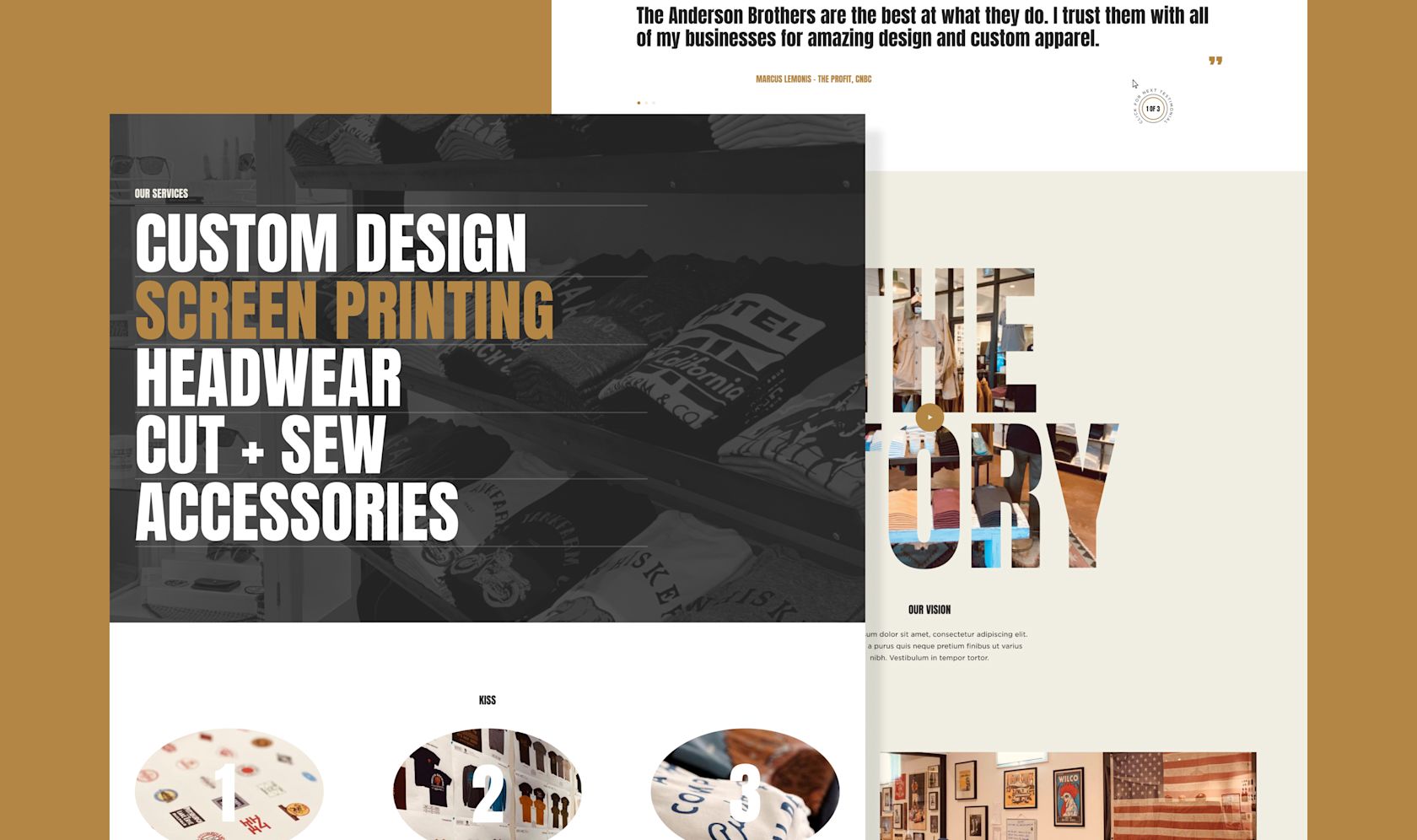
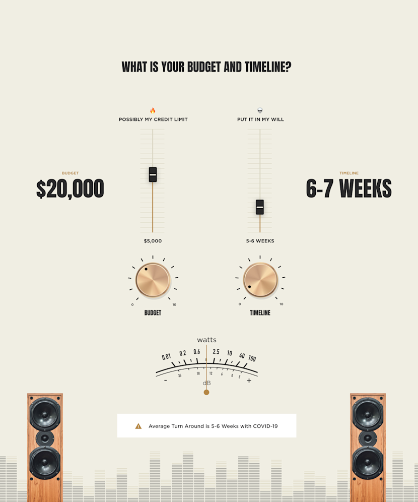
The main purpose of the site was to drive new clients to the form and create something users wanted to engage with. Tactile interactive dials and a rock-n-roll mentality boosted form completion and sales leads.
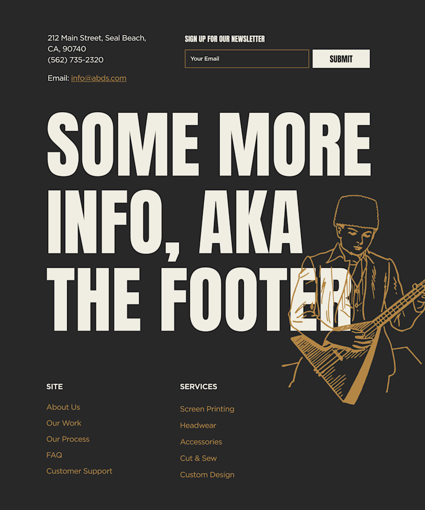
KISS became the mantra for the site. Simple to use, understand, and update.
Motion played a big part in elevating the entire experience. The transition between pages was inspired by screen printing slides rotating in.
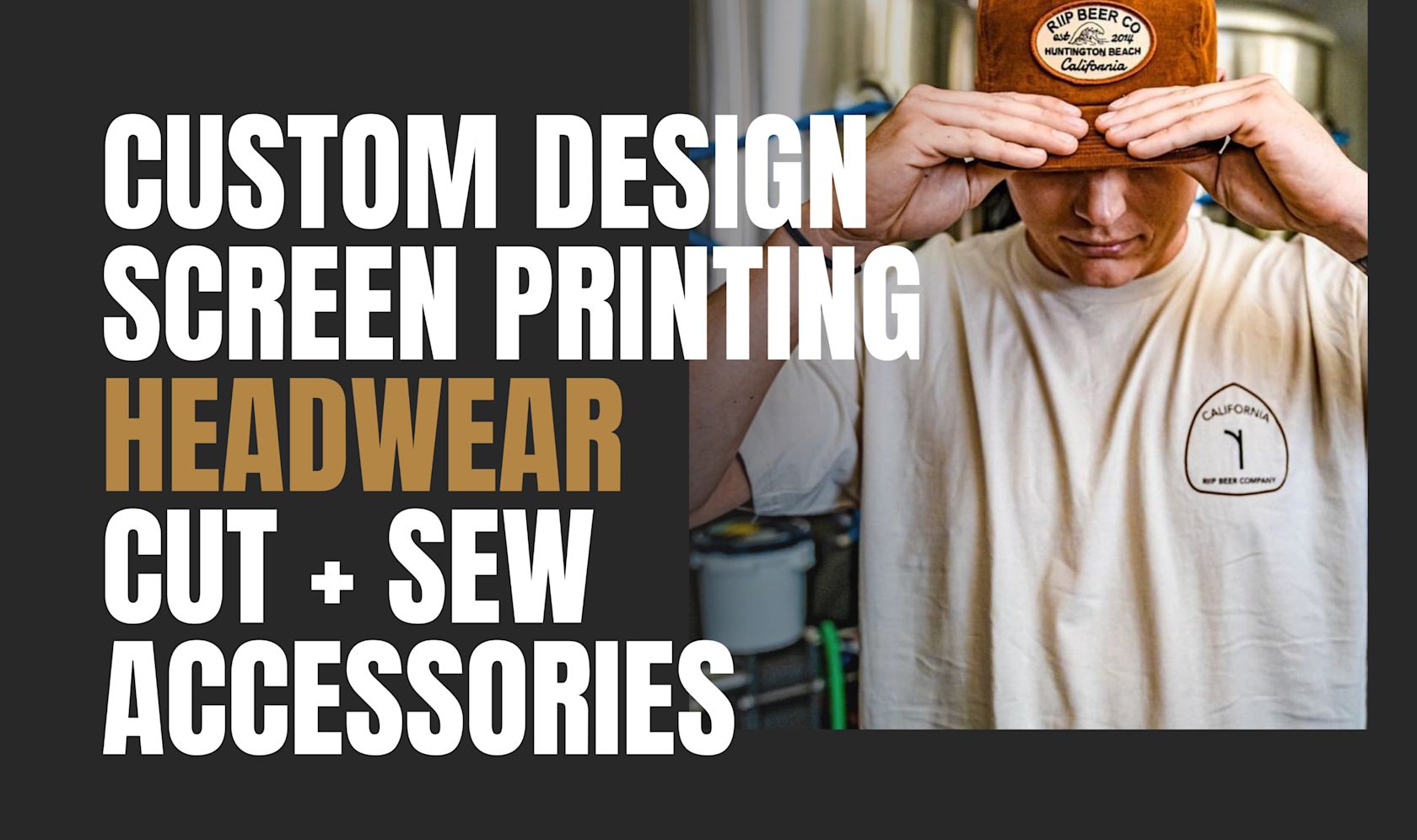
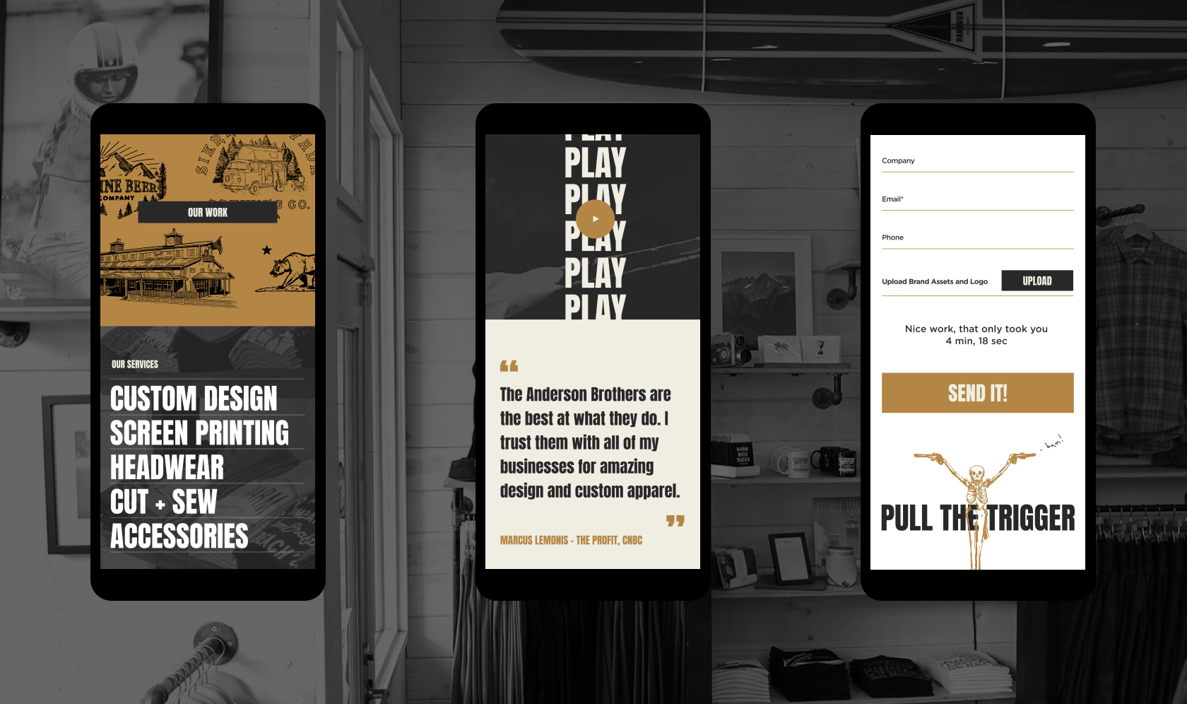
Big, bold and beautiful. A timeless strategy for any brand.
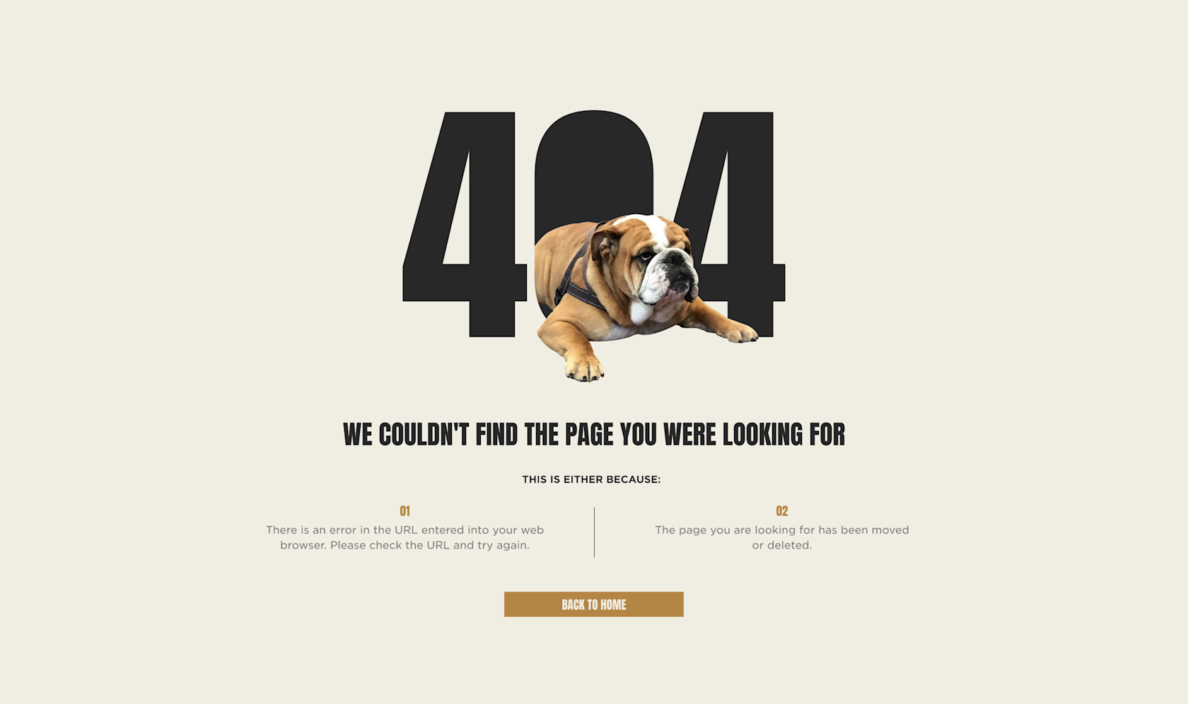
Testimonial
They say the devil is in the details and I smell smoke!
Every aspect and detail of this site was created to push Anderson Brothers brand to the next level and make a statement in the space.
See the live site - andersonsupply.com
The team at seagulls are so f*#king amazing, we were totally blow away!

Creative Director